Helping marketing teams create outstanding card visuals with zero 3D skills
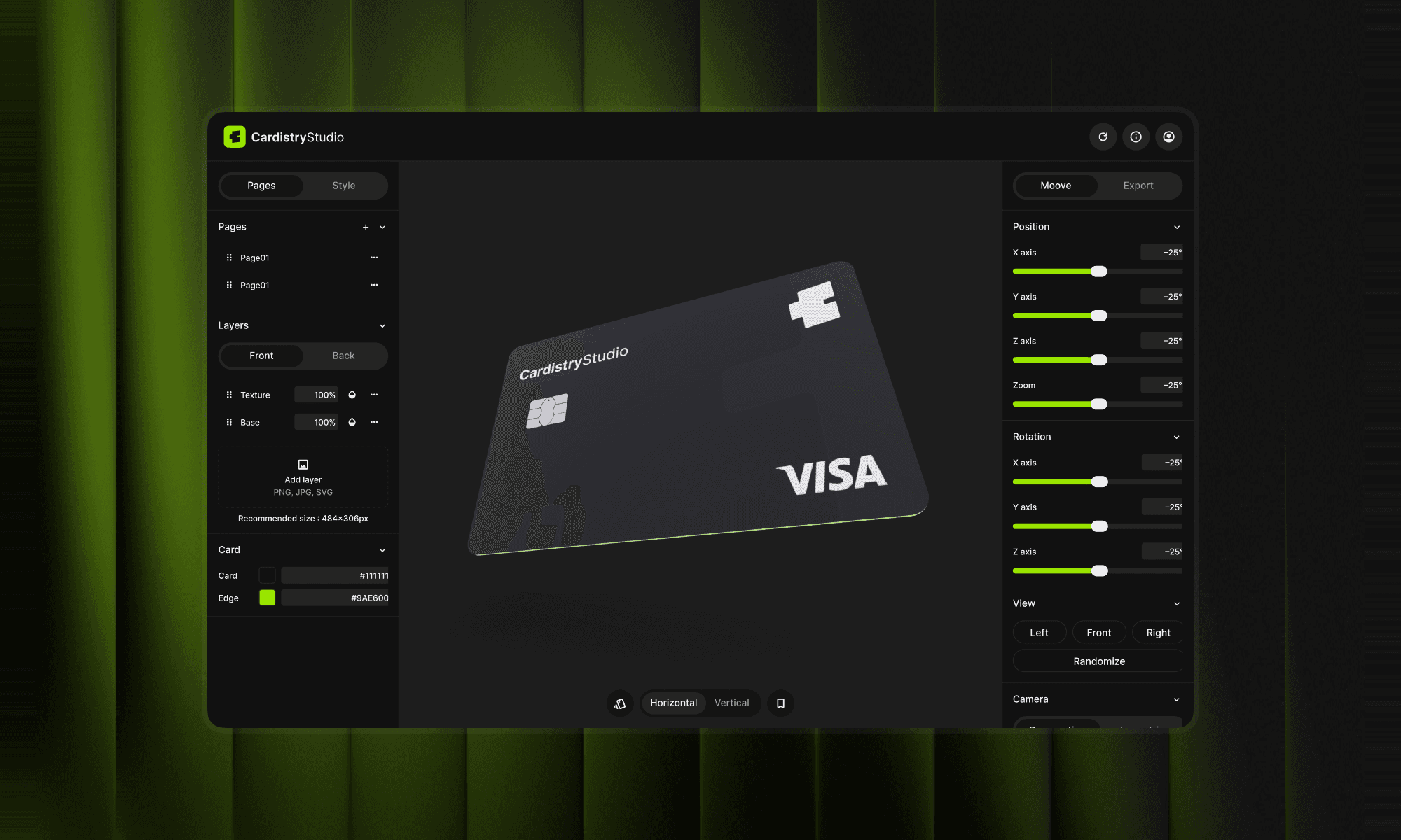
Cardistry is a web tool that turns a flat bank card design into a 3D visual. Upload the front and back, spin the card, pick an angle, tweak colours and lights, then export it ready to publish.
Try Cardistry01. Overview
The project in a minute
Floa’s marketing team kept asking me for new perspective shots of our cards: one card, several, or the full range. Each request went through me, adding up to about 2 hours a week.
So I built a self-serve tool they could use on their own, without limits. It doubled as an AI innovation project, designed and coded end to end with Claude. Once it worked for Floa, opening it to the public as a simple paid product was a small step.
- Role
- End to end: design, build, pricing, launch and rollout at Floa
- Team
- Solo with Claude
- Timeline
- Built over a weekend, iterated over the following month
- Tools
- Claude, Figma, Stripe, Supabase, React and Three.js
- Methods
- Audit and mapping, realism research, alternatives benchmark, first test with marketing
- Problem
- About 2 hours of design time a week on card mockup requests
02. Discovery
From a recurring request to a problem worth solving
Before building anything, I stopped treating each request as a one-off and looked at the job behind it: what marketing needed, what it was using, and what makes a card visual look right.
Three moves: frame the problem, gather evidence from several sources, then decide what goes in.
Problem statement
Floa’s marketing team needs on-brand 3D card visuals several times a week. Every one goes through a designer: about 2 hours of design time a week, and a wait on every campaign.
Job to be done
When I need a card visual for a campaign, I want a realistic angle on my own in under a minute, so I can publish without waiting for design.
What do I know for sure?
Two sources to ground the problem: what the team really asks for, and what a credible card looks like.
Audit and mapping
What I wanted to know
I sorted the marketing team’s requests, then traced one from the first message to the delivered image.
What I found
Three shapes of request: one card, several, or the full range, always the same few angles. The design took minutes; the rest was back-and-forth.
What I did with it
The goal became a loop the team could run alone: import, angle, export.
Realism research
What I wanted to know
Card designers spot a wrong ratio or chip instantly. A card that looks off loses trust.
What I found
Cards follow ISO/IEC 7810 ID-1. Floa works with its card manufacturer on these standards, so they and the chip layouts are already our reference.
What I did with it
I built the 3D model on those real proportions and chip positions instead of guessing.
Where the alternatives fall short
I rated each way of getting a card visual against what marketing cared about.
Do my assumptions hold up?
I wrote down two hypotheses, built a rough version, and put it in front of the marketing team.
First test with marketing
What I wanted to know
Could someone with no 3D skills get a usable visual alone, on the first try?
What I found
Free rotation was fun but slow: people spun the card, then asked me which angle to use.
What I did with it
Angle presets became the main path, with free rotation as a bonus.
Hypotheses and results
Hypothesis 1
A handful of preset angles covers most requests.
Result 1
Yes: requests kept coming back to the same few angles, and free rotation alone left people unsure which one to pick.
Hypothesis 2
Marketing can produce a usable visual alone, on the first try.
Result 2
Yes, once presets became the main path.
Three principles came out of it
Self-serve or nothing
If marketing still needs me, the tool has failed.
Presets before freedom
One click to a good angle, rotation as a bonus.
Ready to publish
Every export fits a post, an email or a page.
How I knew it worked
Four things to check, each with a goal, a signal to watch and a number.
Autonomy
- Goal
- Marketing gets a usable visual alone
- Signal
- An export with no request to me
- Metric
- From import to export in under 30 s
Time saved
- Goal
- Requests leave my inbox
- Signal
- Fewer card requests to design
- Metric
- 2 hours a week saved
Real use
- Goal
- Marketing reaches for it on its own
- Signal
- Visuals used on real campaigns
- Metric
- 300+ images generated
Satisfaction
- Goal
- It feels worth using
- Signal
- Feedback from the marketing team
- Metric
- Positive feedback in workshops
03. Design process
Structure first, UI last
I flipped the usual order. AI handled the code, my ideas drove the features, and the UI, once the biggest share of the work, came last, as the finishing layer that makes the tool feel premium.
Structure
A first version, all structure
I imagined the whole tool before styling anything: front and back import, a 3D card at real proportions, angle presets, export. Every key element was there, in its rawest form.
Build
Built with Claude
I described each piece, Claude wrote the code, I reviewed and adjusted. A working version was live within a weekend.
Test
Tested, adjusted, again
Marketing used it on real requests. Each round fixed what got in the way, like making angle presets the main path.
Features
My ideas as the feature engine
With the code no longer the bottleneck, an idea could become a feature the same day: layers, card and edge colours, camera and lights, a chip selector based on real card manufacturers.
Polish
The UI layer, last
Only once everything worked did I design the interface: a dedicated design system in Figma, a dark studio look, the details that make it feel premium. The part that used to take most of the time became the finishing touch.
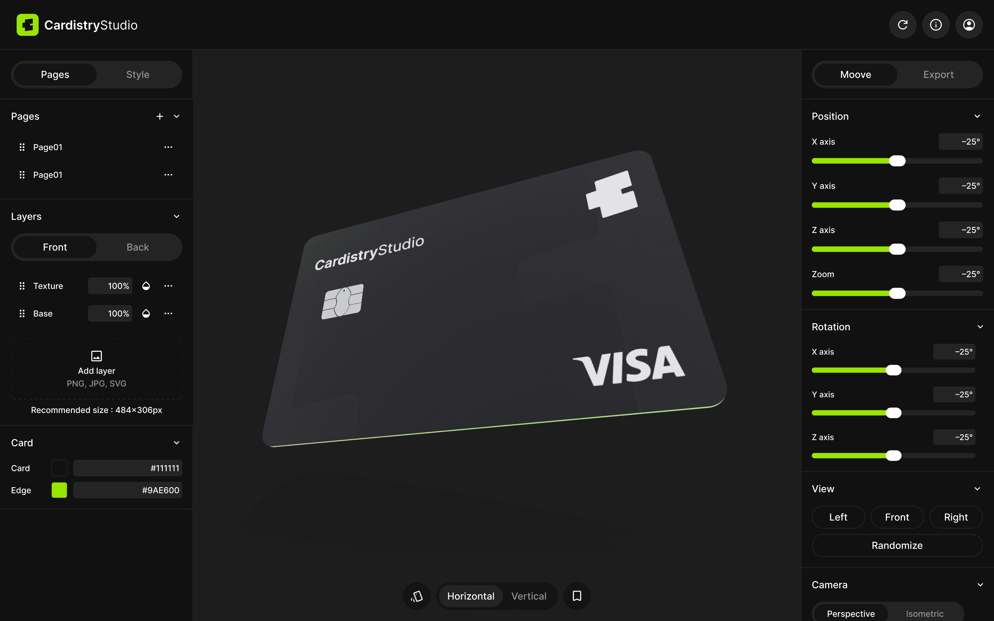
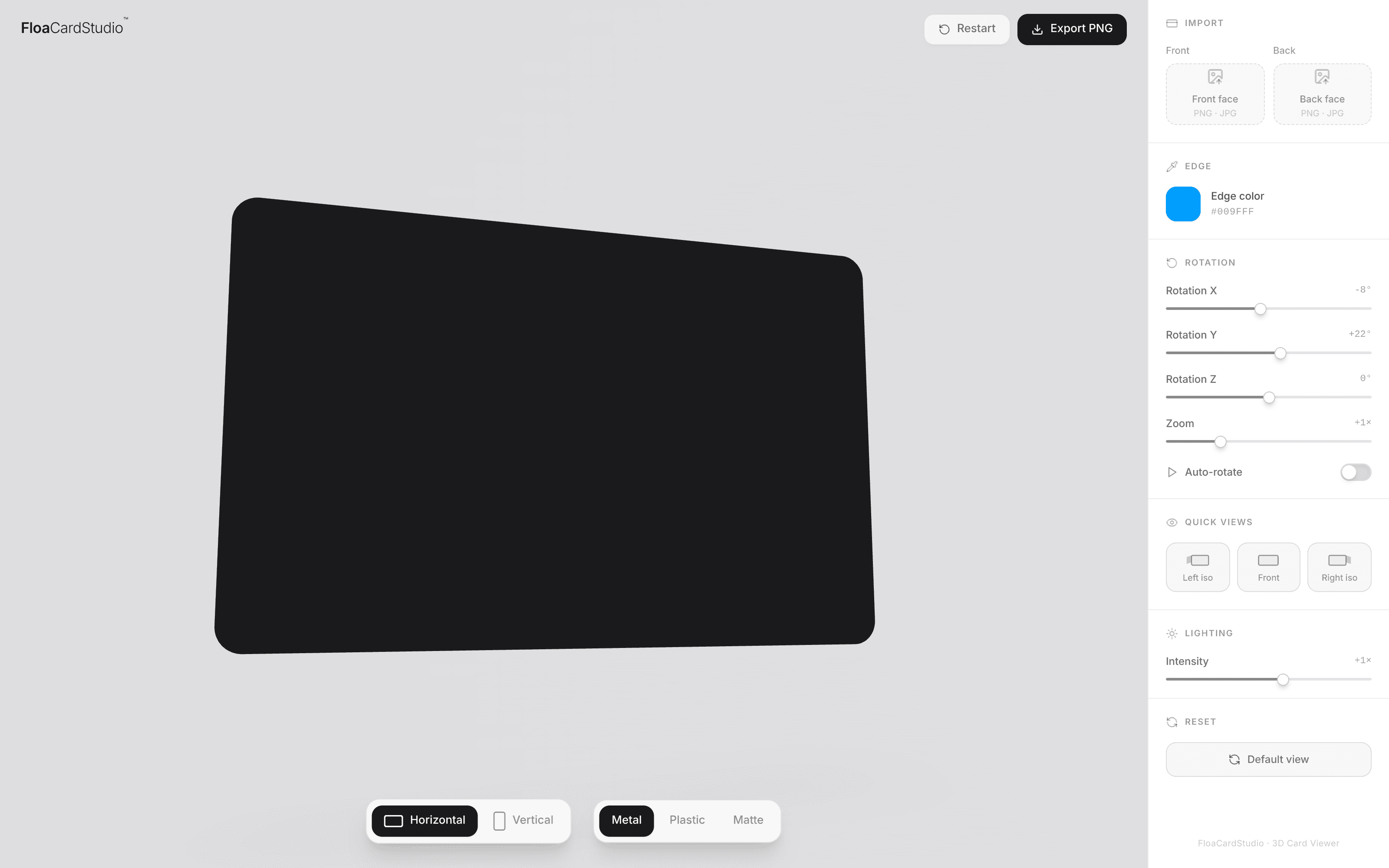
Workshop with marketing Patterns and design system
04. Final design
One loop: import, angle, export
The shipped tool does one thing well: a card design goes in, a presentation-ready image comes out. Inside Floa, the marketing team now makes its own card visuals for social media, emails and the website, without going through me.
The studio, in one screen
Everything sits around the card: what goes on it on the left, how it is seen on the right.
Layers
Front and back go in as layers: texture and base, PNG, JPG or SVG.
Card
A live 3D card at real ISO proportions, with its own card and edge colours.
Format and saved poses
Horizontal or vertical card in one click, and a bookmark to save the poses you like.
Angle
A slider per axis, plus Left, Front, Right and Randomize.
05. Impact
What changed for Floa, and beyond
About two hours of design time handed back every week, around 30 seconds from import to export, and more than 300 images generated so far.
“Before, every new email meant a request to the design team. I’m not a designer, and I don’t need to be: I open Cardistry, choose an angle, and the visual is ready.”
06. Going public
From an internal tool to a paid product
Once Floa’s team used it every week, opening Cardistry to everyone was a small step. Building a visual stays free, with nothing to fill in: an account and tokens only come in at export, three screens between a finished visual and the file.
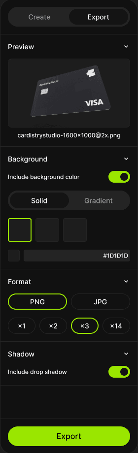
Step 1
Set the export
PNG or JPG, with or without background and shadow.
Step 2
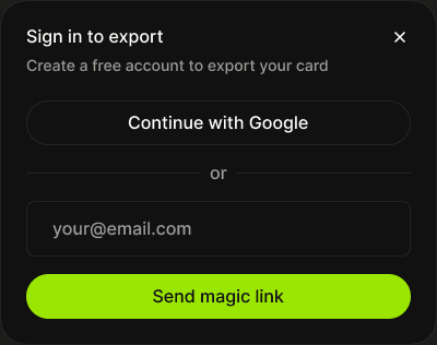
Create an account
Continue with Google or get a magic link by email.
Step 3
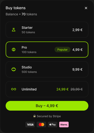
Top up with tokens
Four packs, paid in a Stripe checkout.
What runs behind it
Off-the-shelf building blocks, so a solo project could take payments safely from day one.
Accounts
Supabase
Sign-in with Google or a magic link.
Pricing
Token packs
Four packs from €2.99 to €24.99, paid only at export.
Payments
Stripe
A hosted checkout with cards and Apple Pay.
thanks